12. App Kernels
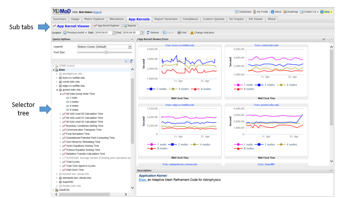
Fig. 12.1 Application Kernels
The Application Kernels Tab consists of three subsections, each has a specific goal in order to make viewing Application Kernels simple and intuitive. The three sections consist of the Application Kernels Viewer, Application Kernels Explorer and the Reports subsidiary tabs. The section below will describe each of these subsidiary tabs in much greater detail
12.1. App Kernels Viewer
The Application Kernel Viewer selector tree (Fig. 12.1) functions similarly to the chart selection tree of the Usage tab. Data is displayed hierarchically where the top level nodes are the names of the available application kernels followed by the resources on which that kernel was run, followed by the metrics that were generated on that resource, followed by the number of processing units used as shown in Fig. 12.1. Clicking on the tree nodes will display a set of thumbnails in the chart viewer that reflects the node’s location in the hierarchy - the farther down in the hierarchy that a node lies, the more specific the set of data displayed. The available node types are:
When navigating the App Kernels Viewer subtab, targeting solely a specific number of node configuration will yield a comprehensive plot:
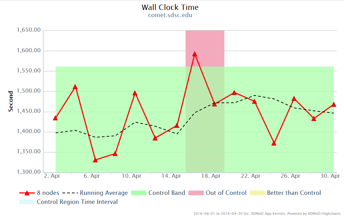
Fig. 12.2 Application Kernel Viewer Plot
The following table helps to analyze the plot more effectively:
Change Indicators |
An exclamation point icon is shown if and whenever a change occurs to the execution environment of the app kernel (library version, compiler version, etc). |
|---|---|
Running Average |
Shown as a dashed line on the chart. The running average is the linear average of the last five values. |
Control Band |
A green band is shown, representing the values of the running average considered “In Control” at any given time. A control region is picked to be the first few points in a data set and updated whenever an execution environment change is detected by the app kernel system. The control band then is calculated by clustering the control region into two sets based on the median and then finding the average of each set. The two averages define the control band. |
Control Zones |
A red interval is shown on the plot when the control value falls below -0.5, indicating an out of control (worse than expected) running average, and a yellow interval when the control value is greater than 0, indicating a better than control (better than expected) running average. Other running average values are considered “In Control”. |
Control Plot |
Represented as a dotted line. The control is calculated as the distance of the running average to the nearest boundary of the control band, normalized over the range of the control band. |
Discrete Controls |
Convert the control values from real numbers to discrete values of -1, 0, 1. Values less than zero become -1 and values greater than zero become 1. |
12.2. App Kernel Explorer
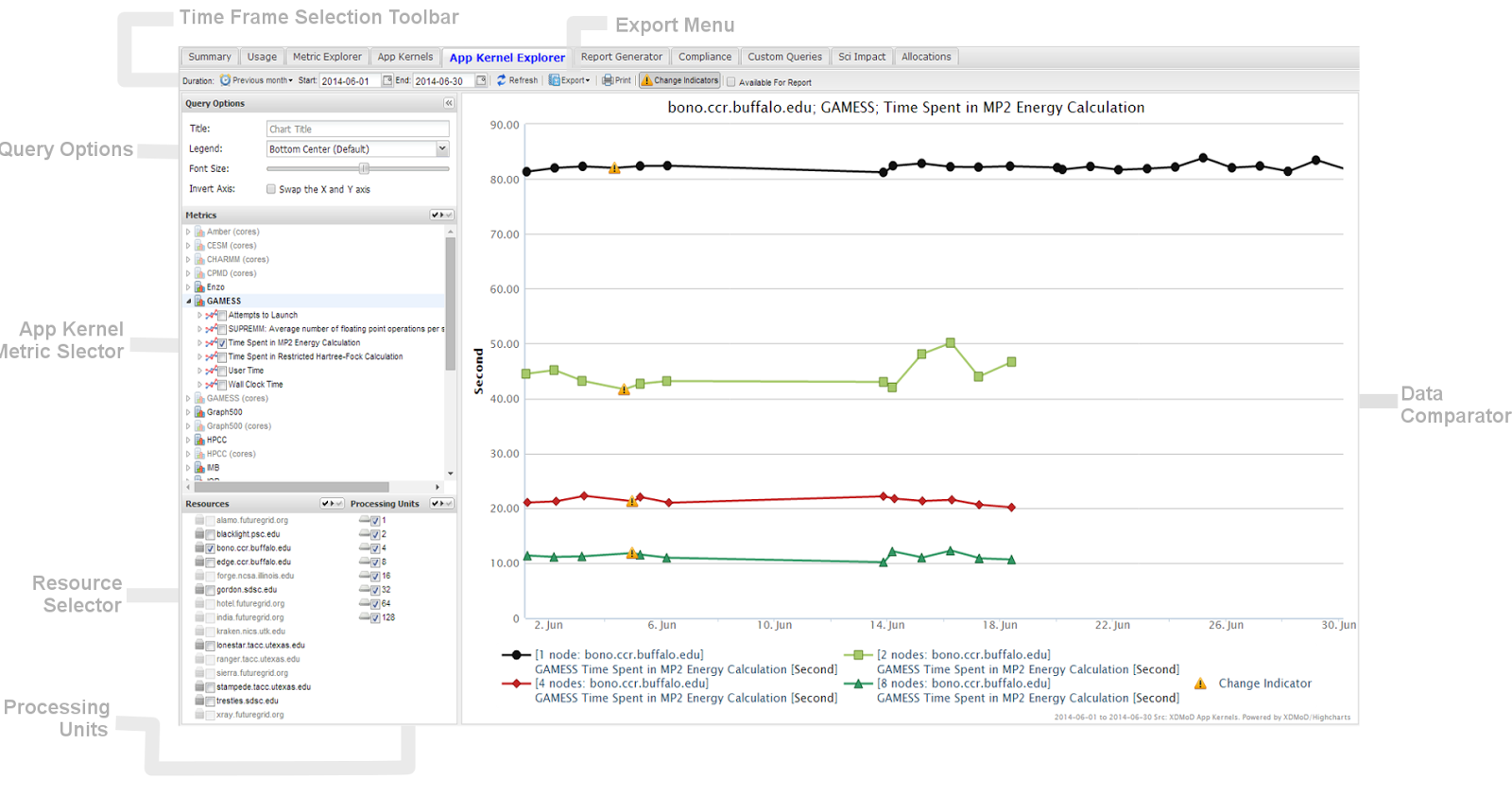
Fig. 12.3 App Kernel Explorer
The App Kernel Explorer (Fig. 12.3) allows you to conveniently compare performance between two or more resources, provided the selection of processing units and metrics. Any changes in selections made on the left-hand section of the Data Explorer will immediately be reflected in the right-hand section (Data Comparator).
It is important to note that changes made in the Metrics Section affect the availability of options in the Resource Selector.
Selections made in the Processing Units section are considered global in the sense that they are applied to every single metric selected. Any selections (and de-selections) made in Processing Units override those made for any metric. Processing units can be selected by clicking the check boxes.
Alternatively, all possible values for either Metrics, Resources or Processing Units can be toggled on or off using the global selection boxes as shown in Fig. 12.4.
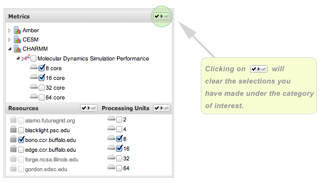
Fig. 12.4 Reset buttons for App Kernel Explorer sections
12.3. Reports tab
The Reports tab (Fig. 12.5) is used for sending reports based on a specific Resource and App Kernel. The first section of the Reports tab is for sending reports periodically. The options include daily report, weekly report and monthly report. Each of these time frames contains a pull down menu which gives a set of options indicating under what circumstances a report will be sent. The options include always, on any error, on any major error, on pattern errors or on major pattern errors.
The weekly report and monthly report also have another drop down menu which gives options for day of the week for weekly report (e.g. Monday, Tuesday, etc.) and which day of the month for monthly report (e.g 1st, 2nd, 3rd, etc.). Once all settings have been selected, you can click save settings in order to start sending reports.
There is also an option to send reports covering specific and customizable date ranges via email; this can be found directly below the first section.
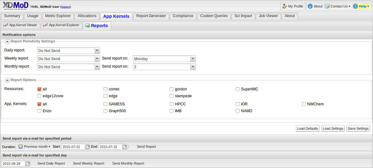
Fig. 12.5 Reports Subtab


