5. Common User Interface Elements
Here we describe some common XDMoD user interface elements.
5.1. Duration Selection Toolbar

Fig. 5.1 Duration Selection Toolbar
The duration selection toolbar (Fig. 5.1) is used for selecting the range of data displayed in a particular data set or chart. It consists of a drop down list containing commonly accessed time frames, as well as a pair of date choosers for configuring the user defined time frames start and end dates, followed by a refresh button for reloading the data and in turn refreshing the screen.

Fig. 5.2 Start and end toolbar |
When you interact with the Start and End date fields, the Refresh button will automatically highlight to indicate that it needs to be pressed to apply the new timeframe. Pressing ENTER in either the Start or End date field will accomplish the same thing. |
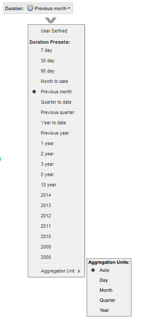
Fig. 5.3 |
The user can choose from a series of commonly selected time frames including 7, 30, and 90 days from the present or 1, 2, 3, 5, and 10 years from the present or a number of calendar years. Alternatively, a user can select their own custom date range for which to display data. The Aggregation Unit selector is located at the bottom of the Duration preset menu. The aggregation unit determines the bin granularity for the time series data. XDMoD automatically chooses a default value dependent on the date range selected. However, the user can override this default value using the aggregation unit selector. Note that for very long time date durations, greater than 2 years, the day aggregation level is not supported. |
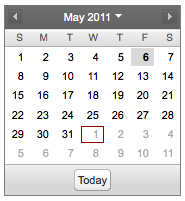
Fig. 5.4 |
The user may choose to click on the |
5.2. Chart Configuration Toolbar

Fig. 5.5 Chart Configuration Toolbar
The chart configuration toolbar (Fig. 5.5) provides options for a user to customize the appearance of individual charts (and their datasheet view), export the data in a number of output formats, and make a chart available to the Report Generator
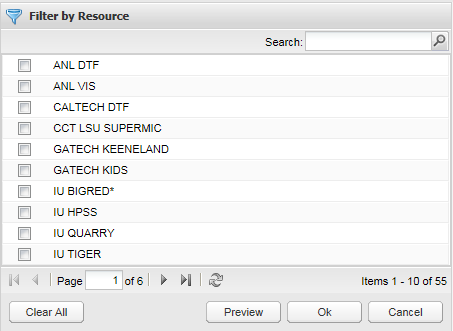
Fig. 5.6 Dataset Filter
When the user clicks on the filter button, the chart configuration toolbar is presented with a multi-selector that provides a list of available data sets to the left and a set of selected data sets to the right, for example, Fig. 5.6 which displays the filter by resource multi-selector. The user can then select the desired filter choices by clicking on the check boxes. The search box and the paging mechanisms shown in Fig. 5.6 are available to assist the user in sorting through filters having large numbers of choices. Note that for the Usage tab that the user must drill down first before the filter becomes active. The manual sections on the Usage tab and the Metric Explorer give more details on the use of the filters.

Fig. 5.7 |
When the user clicks on the Display button in the Usage tab, they are presented with a menu for customizing the display of the current chart or data. Options include:
|
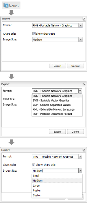
Fig. 5.8 |
Allows the user to download a chart image in a number of formats or to export the underlying data. When the user presses the Export button they will be presented with a list of possible export formats, which include:
The image export options in the Export menu provide the ability to choose the size of the file, the font size and whether to display the chart title in the exported image. The PNG and SVG options have settings for small, medium, large and poster size images and a ‘Custom’ setting that allows fine grained control over the image size in pixels. The PDF option allows the user to specify the width and height of the PDF in inches and the font size in points. |

Fig. 5.9 “Available For Report” check box. |
Selecting the Available for Report check box will cause the chart to be added to the list of available charts for the Report Generator. Note that the chart will retain the duration and display customizations made prior to checking the box. |
5.3. Chart Selection Tree
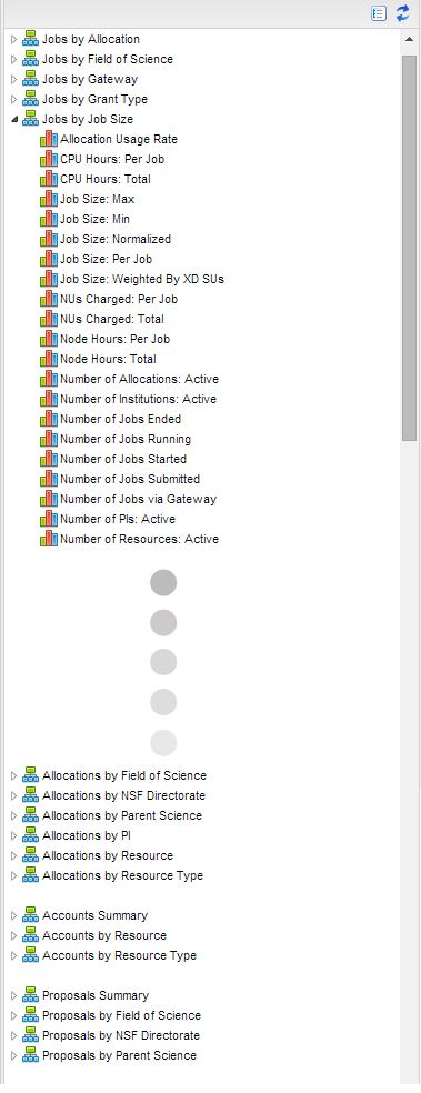
Fig. 5.10 Chart Selection Tree. |
The chart selection tree is displayed in the Usage Tab. The tree nodes are grouped by Realm (e.g., Jobs, Allocations, SUPReMM, etc.) and there are three levels of data (nodes).
|
Selection of a node in the tree can be accomplished by left-clicking the node. A triangular icon to the left of the tree node will point to the right when the node is collapsed and will point to the bottom right and have a black fill when expanded. Double clicking a node will select and expand it. Selected tree nodes are indicated by a light blue background.
Collapse All Button  : This will collapse all of the expanded
nodes in the tree.
Collapse Selector Tree Button  : This will collapse the Usage
tab Chart Selection Tree to the left so that it is only visible as a
thin vertical bar to the left of the screen providing more screen area
for the display of the selected chart or data sheet. Clicking on the
button will show the Selector Tree again.
5.4. Chart Viewer
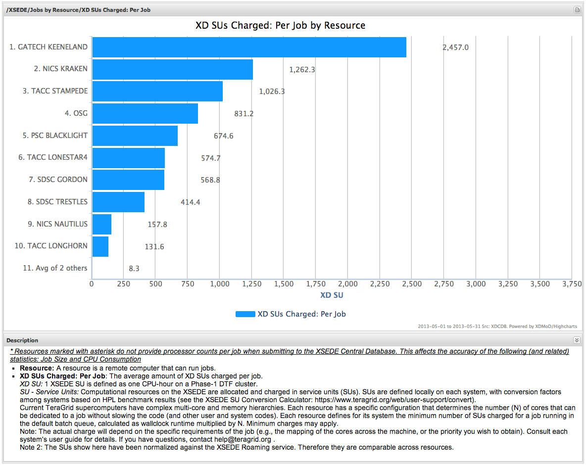
Fig. 5.11 Chart Viewer
The chart viewer is shown in Fig. 5.11 and provides an area where the user can view and customize metric data as well as export the data or make the chart available for inclusion in a custom report. At the top of the Chart Viewer is a trail of breadcrumbs that shows the origin of the chart. The chart shown in Fig. 5.11 is from the ACCESS view of the Usage tab. The Jobs by Resource category is expanded, followed by selection of the XD SUs Charged: Per Job metric.
Every chart in XDMoD can zoom along a specific axis by clicking and dragging the cursor in a straight line vertically or horizontally to zoom along the y-axis or x-axis, respectively. When adjusting the zoom along a specific axis you will be able to adjust the range of the data based on how far you drag your cursor. Every chart in XDMoD can also zoom along both the x- and y-axes adjusting the range for both. For most charts in XDMoD, the zoom level can be reset by double clicking on an empty area of the plot. The only exception is for charts in the Metric Explorer tab, where you can reset the zoom by clicking on the chart and choosing the “Reset Zoom” option from the context menu.
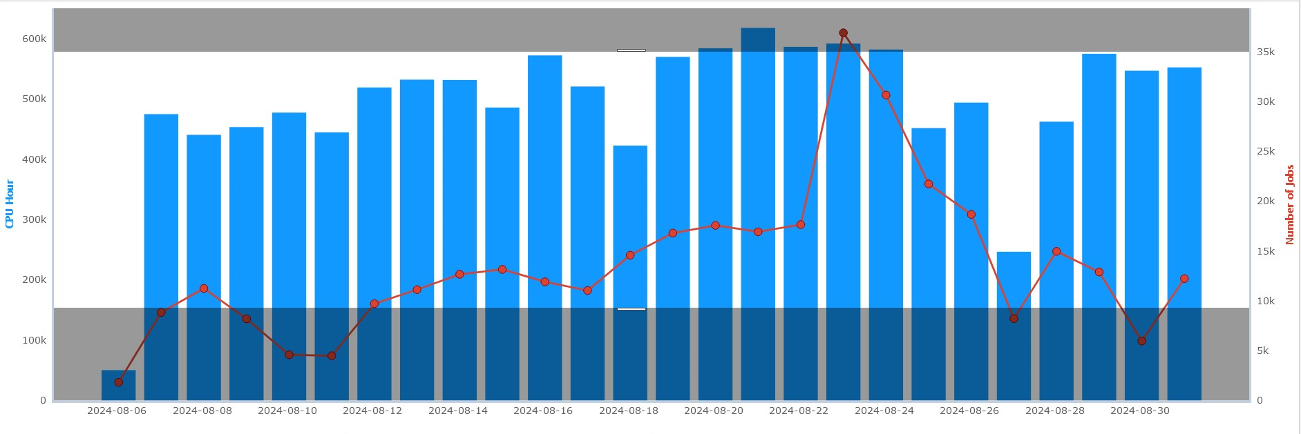
Fig. 5.12 Example of adjusting the zoom along the y-axis (vertically).

Fig. 5.13 Example of adjusting the zoom along the x-axis (horizontally).
Drilldowns: Most of the charts displayed in XDMoD have a drill-down capability, which will allow users to click on a data series (bar, line, pie slice, etc.) and acquire more detailed information about the relevant selection. This is accomplished by hovering the mouse over a particular data series in a chart and clicking on it, causing a new drilldown node to be displayed in the Chart Selection Tree and the new chart to be displayed. When drilldowns are available, the cursor will change from an arrow to a hand. Whenever a drilldown is not possible the user will be notified via a tooltip.

Fig. 5.14 Example of when dilldown is available vs when drilldown is not available
For example, if the second horizontal bar in Fig. 5.15 is clicked on (NICS KRAKEN), followed by the selection of Field of Science from the menu that appears, the chart shown in Fig. 5.16 will appear. This new chart will take into account all fields of science which have contributed to charging XD SUs to resource NICS KRAKEN (respective of the timeframe selected). Note that the breadcrumb trail reflects the origin of the chart.
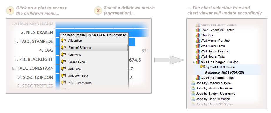
Fig. 5.15 Example of adding a drilldown metric
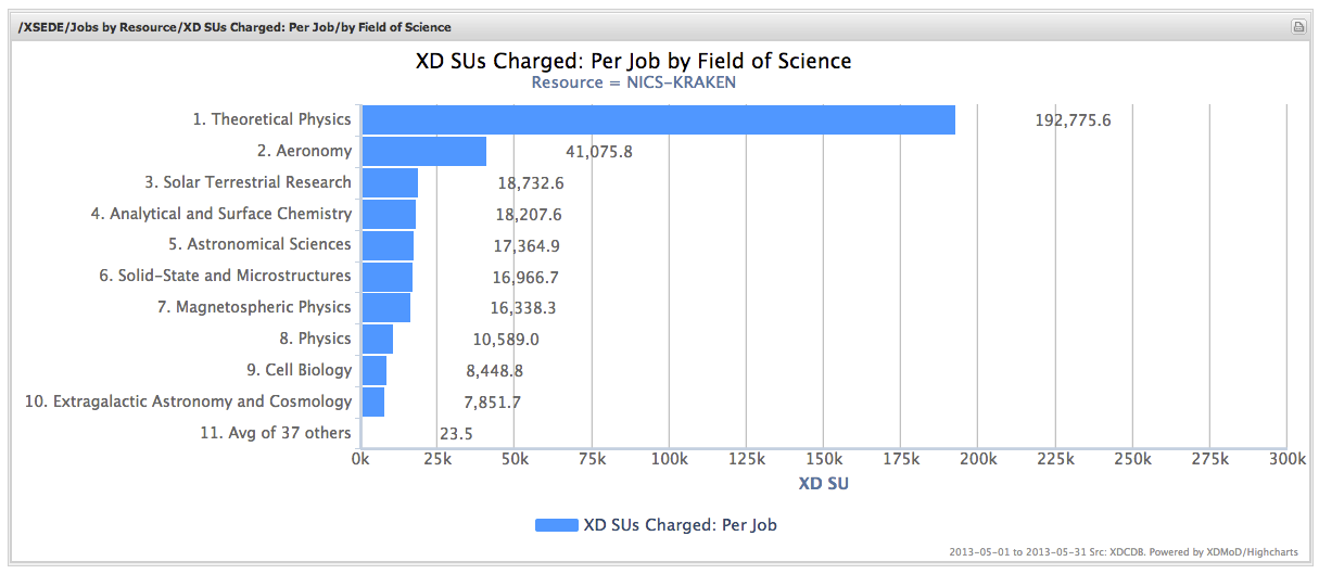
Fig. 5.16 Example of a drilldown chart
5.4.1. Chart Viewer Tools

Fig. 5.17 Chart Viewer Tools (Thumbnail Views)
Located on the top right of the Usage tab chart viewer when a dimension is selected, from left to right, this toolbar consists of the following buttons:
Restoring the thumbnails to their original dimensions
Reducing the chart size
Increasing the chart size
 Preset time frames
menu
 Custom time
frames - interactive data
chooser
 Display menu.
 Export menu
 These are the
first level of nodes in the
tree and are defined based on
the inherent grouping of the
data, e.g. by Resource, by
Provider, etc.. When selected,
the chart view will update and
display the thumbnails or data
sheets for all of the facts
available for the selected
dimension, e.g. Number of Jobs,
Total SU charged, etc..
 Fact nodes are
children of the dimension nodes
and when selected will load the
chart or datasheet associated
with the selected fact.
 Drilldown
nodes are children of fact
nodes and are displayed when a
user clicks on a chart data
series (e.g., bar, line, or pie
slice) to drill down to more
detailed information about that
series.