15. Efficiency
The Efficiency Tab displays information about the efficiency of jobs running on the resources at your center. The initial display (Fig. 15.1) shows analytic cards that each have a small description of the analytic and a thumbnail view of a scatter plot showing efficiency regarding that specific analytic. The scatter plots are intended to give you a quick view of which analytics need to be investigated more for poor efficiency.
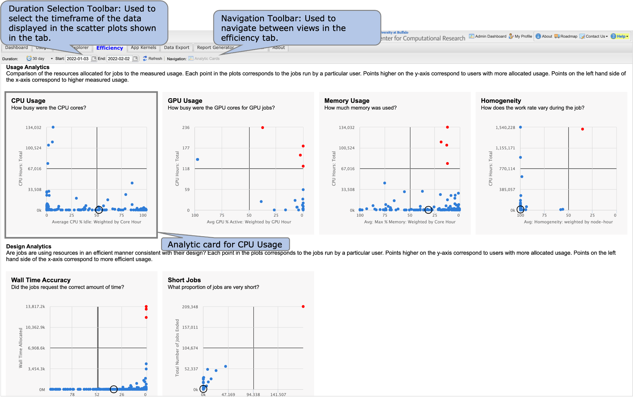
Fig. 15.1 Efficiency Tab. The efficiency tab shows analytic cards when you first navigate to the tab which give efficiency information about users’ jobs at your center.
A larger, interactive view of the scatter plot can be seen by clicking on the analytic that you want to learn more about (Fig. 15.2). The scatter plots are described in more detail in Section 15.1 - Scatter Plot View.
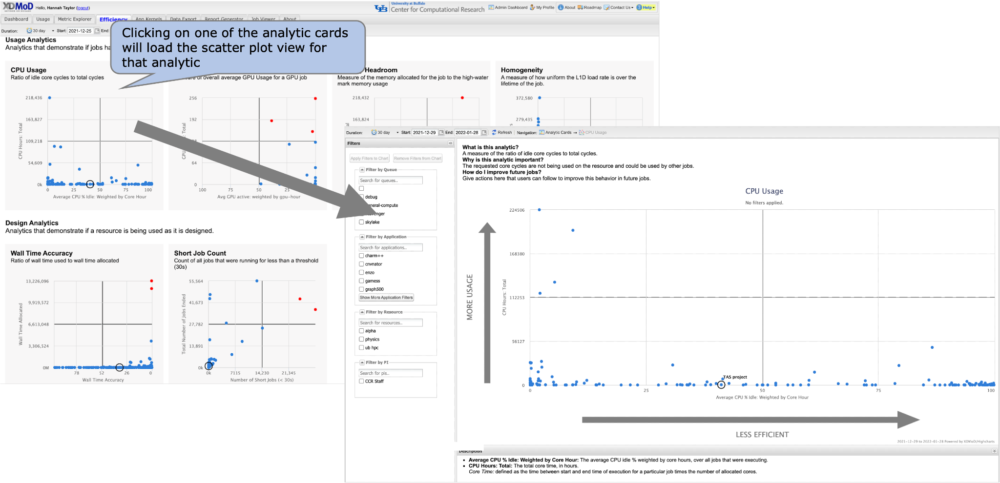
Fig. 15.2 When you click on one of the analytic cards, you will be redirected to the scatter plot view.
Analytics are categorized into two bins - analytics associated with usage and analytics associated with design. Usage analytics compare resources allocated for a job to measured usage for the job. Design analytics determine if jobs are using resources in an efficient manner consistent with their design. Table 15.1 below lists the available analytics and the associated description for each analytic.
Analytic |
Description |
Category |
|---|---|---|
CPU Usage |
Measures the percentage of time that the CPU cores were idle. |
Usage |
GPU Usage |
Measures the percentage of time that the GPUs were busy. |
Usage |
Memory Usage |
Measures the overall highest memory usage for jobs. |
Usage |
Homogeneity |
Measures how uniform the work rate of the job is. |
Usage |
Wall Time Accuracy |
Measures how well used wall time matches requested wall time. |
Design |
Short Jobs |
Measures the number of jobs that ran for 30 seconds or less. |
Design |
15.1. Scatter Plot View
This view shows a larger, interactive scatter plot for the analytic selected by clicking on its corresponding analytic card. For example, Fig. 15.3 shows the CPU Usage Scatter Plot View.
All scatter plots are initially the same as the thumbnail plot in the previous view, but you have the ability to apply filters, zoom in, and drill down in this view. Each point on each of the scatter plots represents data for the jobs of a particular user with the efficiency statistic plotted on the x-axis and the overall usage plotted on the y-axis. Table 15.2 shows the analytics and their associated efficiency and usage statistics that are plotted in the scatter plots.
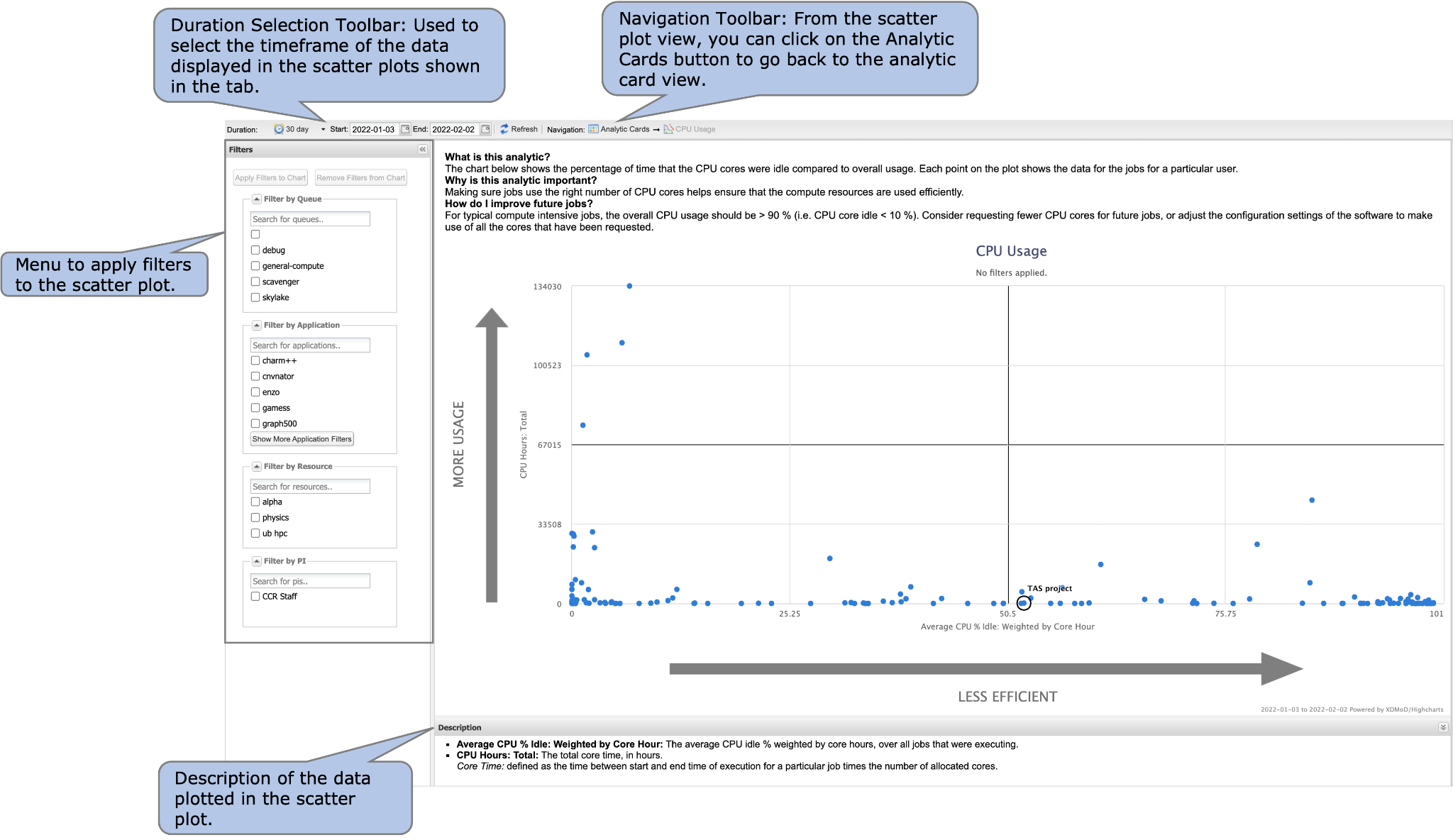
Fig. 15.3 Scatter Plot View. This view displays a larger scatter plot that allows drill downs and filters to be applied. The view also includes help text to give more context about the analytic and ideas for improving efficiency in regard to this analytic.
Analytic |
Scatter Plot Statistics |
|
|---|---|---|
Efficiency Statistic |
Usage Statistic |
|
CPU Usage |
Average CPU % Idle: Weighted by Core Hour |
CPU Hours: Total |
GPU Usage |
Average GPU % Active: Weighted by GPU Hour |
GPU Hours: Total |
Memory Usage |
Avg: Max % Memory: Weighted by Core Hour |
CPU Hours: Total |
Homogeneity |
Avg: Homogeneity: Weighted by Node-Hour |
CPU Hours: Total |
Wall Time Accuracy |
Wall Time Accuracy |
Wall Time Allocated |
Short Jobs |
Number of Short Jobs (<30s) |
Total Number of Jobs Ended |
Points higher on the y-axis represent more usage and points on the left hand side of the plot correspond to a high measured usage. The upper right hand quadrant of each scatter plot represents users with jobs that have a lot of usage on the system and are running inefficiently in regard to that analytic. A tooltip appears (Fig. 15.4) when you mouse over a point to show the user name (if you have access), the efficiency statistic value, and the usage statistic value.
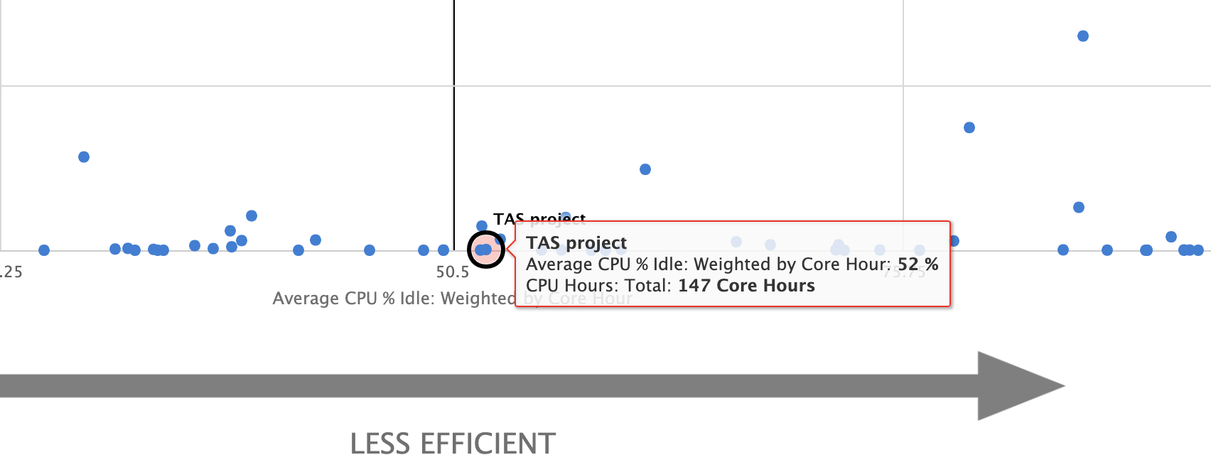
Fig. 15.4 A tooltip giving information
about the user, their efficiency, and
usage of their jobs appears when you
mouse over a point in the scatter plot.
You can use these to compare efficiency of your jobs against other users’ jobs at the same center. If you have access to the user, you are able to click on their point on the scatter plot to drill down and view more information about that user’s jobs’ efficiency (Fig. 15.5). When you drill down, you will be presented with a histogram chart (Fig. 15.7) which is described in Section 15.2 - Histogram View.

Fig. 15.5 Clicking on a point in the scatter plot that you are allowed access to will take you to the histogram view for that user which shows more information about that user’s jobs.
There are slight variations to the scatter plot view you will see depending on the user access that you have. These are described below in Section 15.1.1 and Section 15.1.2 The main differences between the views are the markers used on the scatter plot and the ability to drill down and learn more about a user’s jobs. The markers are shown in Fig. 15.6.
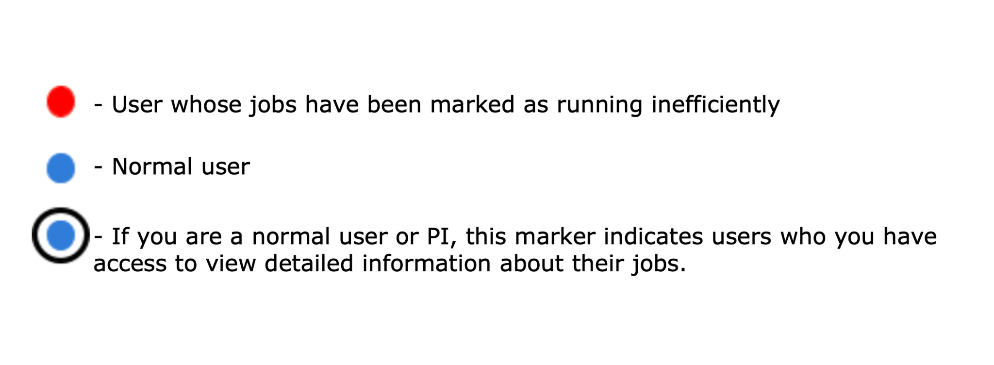
Fig. 15.6 Different markers used to indicate users on the scatter plot.
15.1.1. Center Staff View
Center staff can view all users at the center that have data to be displayed on the scatter plot. Each user is marked with either a red or blue marker on the scatter plot. A red marker indicates a user that has been flagged as running jobs inefficiently in regard to the analytic that is being shown. A blue marker indicates a normal user. As center staff, you have access to all users and therefore have the ability to view all names in the tooltips and drill down on any user in the scatter plot to learn more about the jobs that they are running.
15.1.2. PI or Normal User View
PIs have access to their own point as well as points that represent their users. This is indicated by a black circle around the points that you have access to. Normal users only have access to their own data and therefore can only drill down on their own point.
The data that appears in the scatter plot can be altered by changing duration and applying filters. Applying filters to the scatter plot is described in Section 15.4 - Filtering Charts and changing duration is described in Section 15.5 - Selecting Duration of Charts.
15.2. Histogram View
If you have access to view information about a specific user, you can drill down to the histogram view from the scatter plot view. The histogram view for each analytic gives a more detailed analysis of a specific user’s jobs in relation to the analytic that is being investigated. For example, Fig. 15.7 shows the histogram view for the CPU Usage analytic.
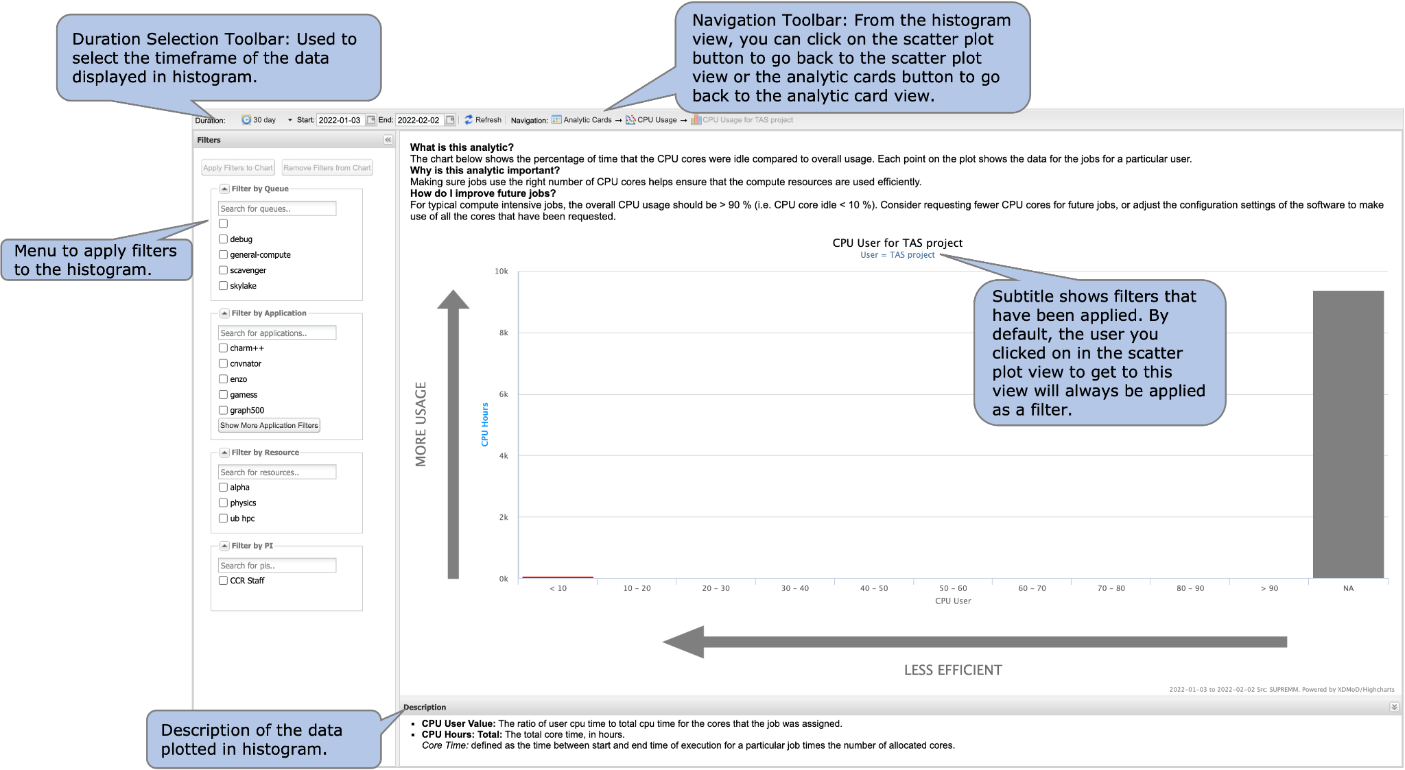
Fig. 15.7 Histogram view. This view gives a more detailed view of a specific user’s jobs.
If you were to drilldown from the CPU Usage scatter plot on a specific user, you would see their jobs binned by the CPU User value compared to the overall CPU Usage for jobs in that bin. The bins are color coded according to efficiency and the color coding is unique to the analytic that is being displayed. However, in each histogram view red is associated with jobs that were running more inefficiently while green is associated with jobs that were running more efficiently.
The histogram chart can be modified to learn more information about the user’s jobs. You can change the duration of the data included in the histogram by using the duration selector toolbar as described in Section 15.4 - Filtering Charts and filters can be applied to the chart as described in Section 15.5 - Selecting Duration of Charts.
To learn more information about the user’s jobs that were included in each of the bins, you can click on any of the bars in the plot that have data in them. Clicking on them will bring up a window that lists all jobs that were grouped in the category that you are viewing (Fig. 15.8).
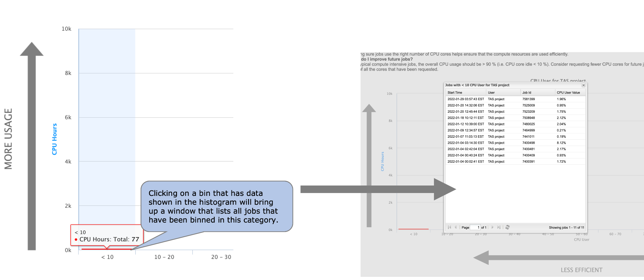
Fig. 15.8 Clicking on a bin in the histogram plot will bring up a list of all jobs that were binned in this category.
15.3. Job List
As shown in Fig. 15.8, a job list window will appear when you click on one of the bars from the histogram plot (as described in Section 15.2 - Histogram View). The job list window for each analytic varies slightly concerning the data that is shown in the window.
You can click on a row in the job list table to view that job in the Job Viewer (Fig. 15.9). When you click on a job, you will be redirected to the Job Viewer tab with that job showing. This will provide you with more details about the job.
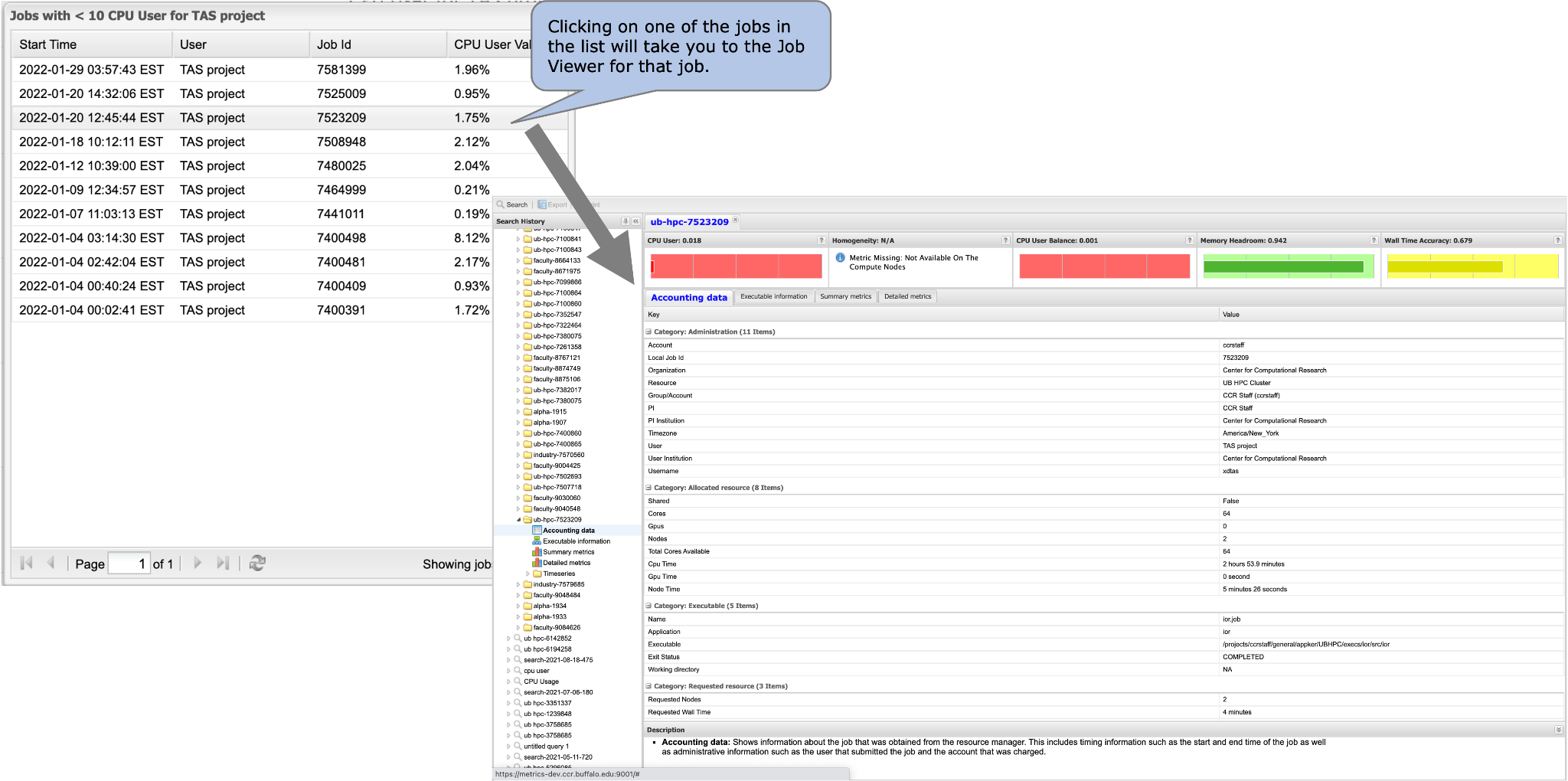
Fig. 15.9 Clicking on a row in the job list table will take you to the Job Viewer for that job.
15.4. Filtering Charts
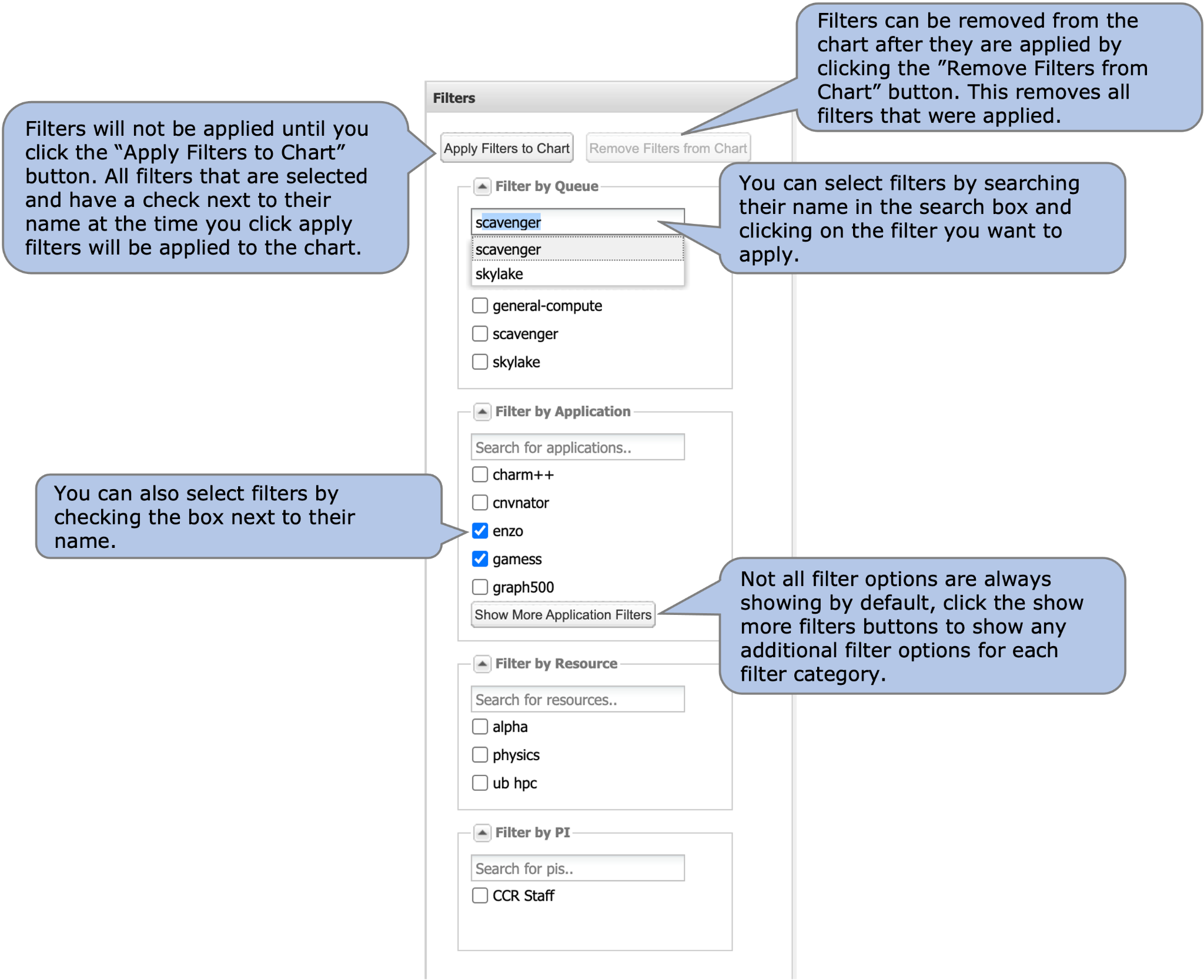
Fig. 15.10 Filter Menu.** Select filters you want to apply to the chart from this menu and apply these using the “Apply Filters to Chart” button.
In addition to drilling down on the charts to get more information, you can also filter the results that you see on the scatter plot and drill down charts. In both cases, you use the filter menu on the left hand side of the chart to apply filters. There is filtering available for four categories - queue, application, resource, and PI. You can choose filters by either checking the box that corresponds with the filter that you want to apply or by searching the filter in the search box of the category you are interested in and clicking on the filter that you want to apply from the dropdown box.
Once all filters that you want to apply are checked, click on the Apply Filters button in the top of the filter menu to apply those filters to the chart that you are looking at. The chart will reload and filters that have applied will be listed in the subtitle (Fig. 15.11).
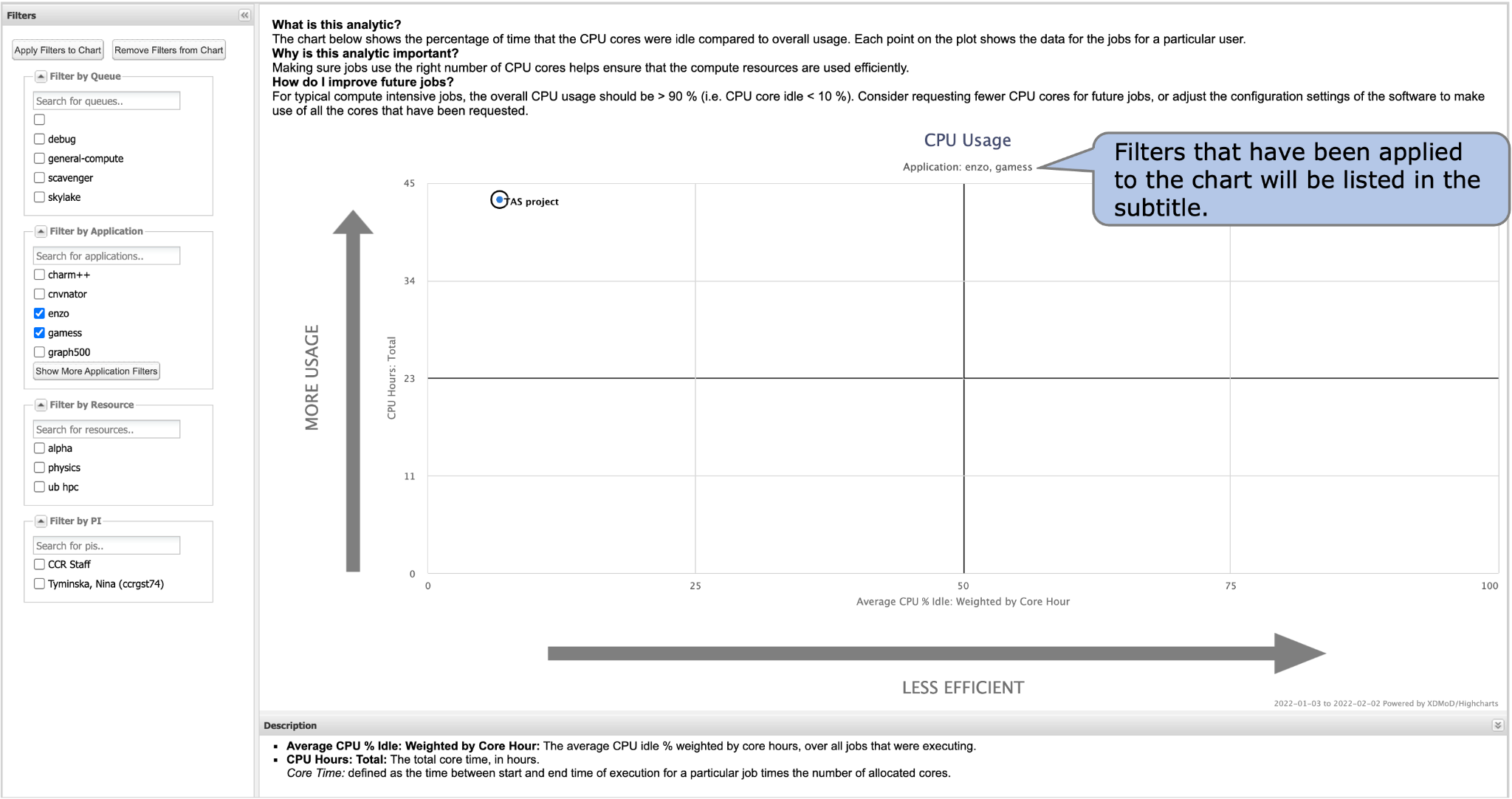
Fig. 15.11 Filters that have applied to the chart will be listed in the subtitle of the chart.
To remove all filters, click on the Remove Filters button at the top of the filter menu and the chart will be reloaded with no filters applied. If you only want to remove a select number of filters from a chart that has filters previously applied, you will need to uncheck the filters in the filter menu and click the Apply Filters button again.
Note: If you change the duration of the plot that you are viewing, filters will remain applied as reflected by the filters listed in the subtitle. To remove filters, use the Remove Filters from Chart button at the top of the filter menu.
15.5. Selecting Duration of Charts
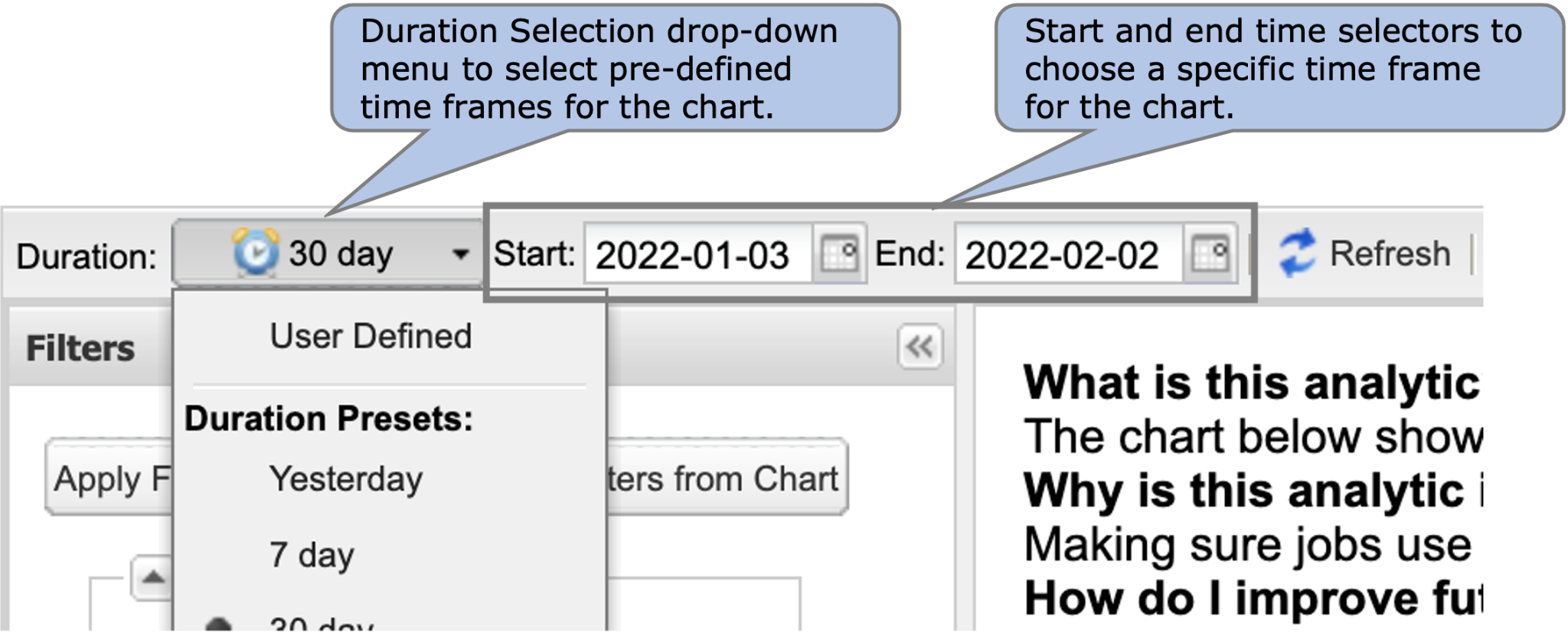
Fig. 15.12 Duration Selection Toolbar.** Use this toolbar
By default all charts show data from the previous 30 days. You can change this duration for any of the views at any time to view data from a different time frame. In each view, there is a duration selection toolbar present in the upper toolbar (Fig. 15.12). You can choose a pre-defined timeframe from the duration drop-down menu, or specify a start and end date in the date fields to the right of the drop-down menu to select a custom timeframe.
to select a timeframe for the chart that you are viewing.
