7. Dashboard Tab
The dashboard tab is the first tab displayed to logged in users. It displays various information in separate display windows called components. The information displayed in the dashboard varies according to the assigned role of each user account. Table 7.2 lists the default settings for each role.
Role |
Components Displayed |
|---|---|
Program Officer |
Center Summary (all Centers) Saved charts and reports Center Report Card (all Centers) |
Center Director |
Center summary Saved charts and reports Center Report Card |
Principal Investigator |
Recent jobs Job Efficiency Report Summary Charts |
User |
Recent jobs Job Efficiency Report Summary Charts |
The various dashboard components are described below.
7.1. Dashboard Components Overview
There are two categories of dashboard components: full-width components and half-width components. Full width components are in a fixed location at the top of the dashboard tab and the half-width components are arranged in columns. All half-width components have a title bar such as the example shown in Fig. 7.1. The title bar includes the name of the component and, for components that show data limited by time. show the date range of the data. Clicking the question mark icon on the right of the title bar will show a help window that explains how to use the component.

Fig. 7.1 Example title bar of a dashboard component. Typically the title includes information about the date range of the data. The question mark button on the top right is used to open a help window. Some components also have additional icons for component-specific features.
The layout of the half-width dashboard components can be customized by dragging the title bar of a component (Fig. 7.2). The layout settings are saved automatically and persist between logins. The layout can be reset to default using the Reset to default button in the Settings tab of the My Profile dialog (Fig. 7.3). The My Profile dialog is accessed via the My Profile button on the top right of the XDMoD portal. Full-width dashboard components cannot be moved.
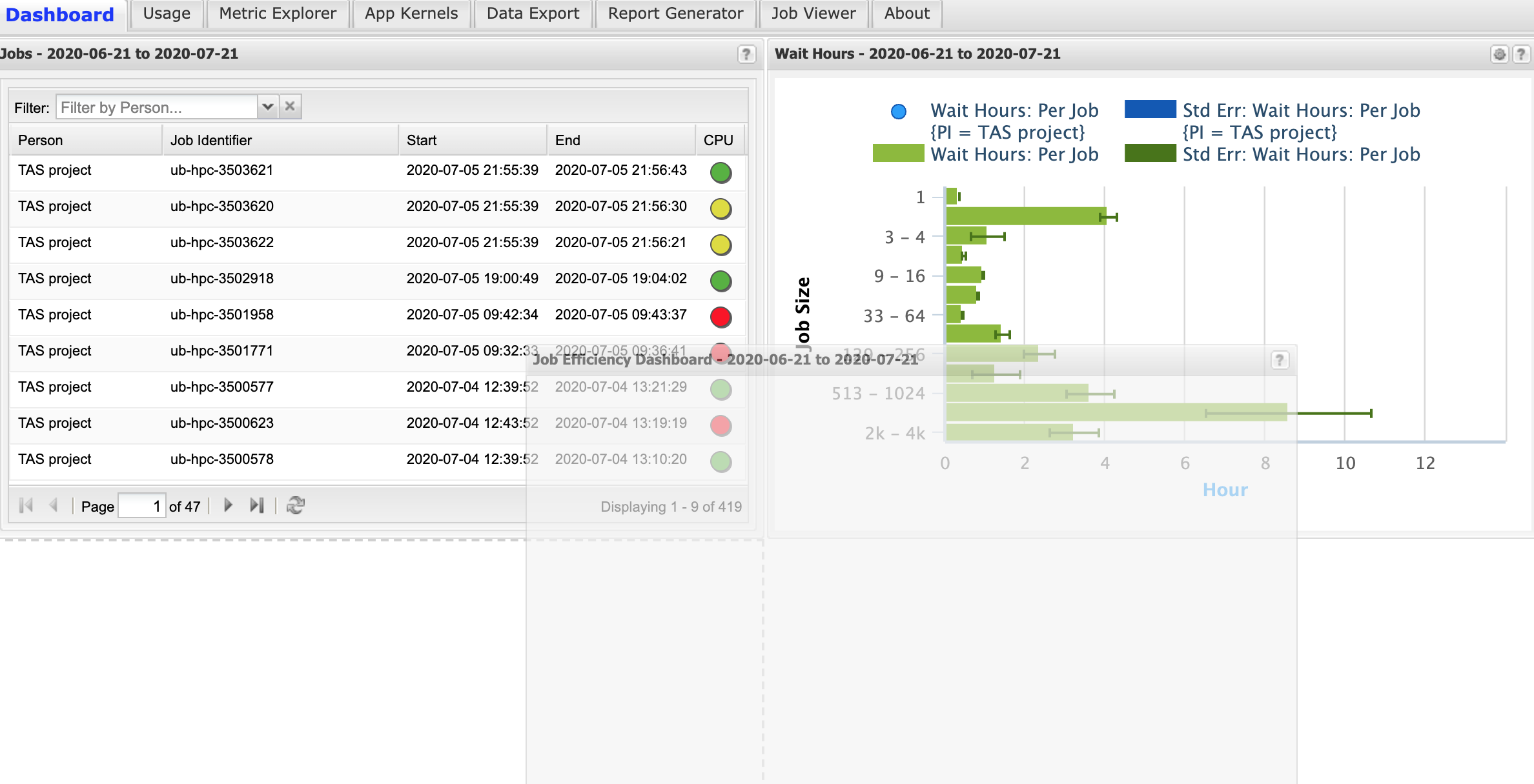
Fig. 7.2 Example of rearranging the layout of half-width dashboard components. A component can be moved by selecting the title bar and dragging into the new position.
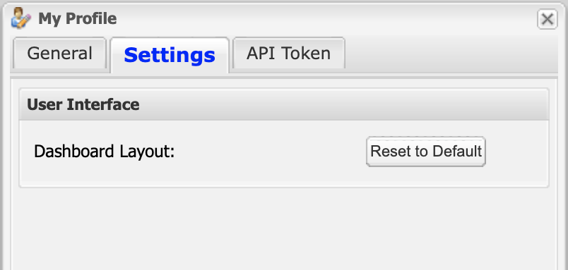
Fig. 7.3 The dashboard layout can be reset to the default value using the button available in the Settings tab of the My Profile dialog.
7.2. Chart Component
The Chart Component shows charts from the Metric Explorer. An example of the chart component is shown in Fig. 7.4. The time range of the chart is shown in the title bar. The wheel icon on the top right of the component will open the chart in the Metric Explorer.
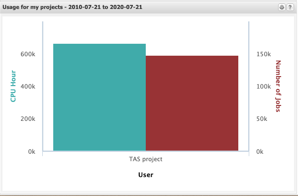
Fig. 7.4 Example of a chart component. The time range of the chart is shown in the title bar. The wheel icon on the top right will open the chart in the Metric Explorer.
The default chart configuration settings are controlled by the XDMoD system administrator. Extra charts can be added to the dashboard via the Metric Explorer. Charts are added via the Show in Summary tab checkbox in the Metric Explorer basic chart options (see Section 9.2 for more information).
It is also possible to edit the default charts via the Metric Explorer. Click the wheel icon on the top right of the chart component to open the chart in the Metric Explorer. You can then edit the chart in the Metric Explorer and save the chart without changing the chart name field or deselecting the Show in Summary tab checkbox. To reset a system chart to the default just delete it from the list of save charts in the Metric Explorer.
7.3. Saved Charts and Reports Component
Fig. 7.5 shows the saved charts and reports component. This component lists a user’s charts that were saved in Section 9 - Metric Explorer and their reports from Section 14 - Report Generator. The list can be sorted by the name, type (chart or report), and last modification date. By default, the list is sorted by the last modification date in descending order. The user can filter the list by name by using the search box.
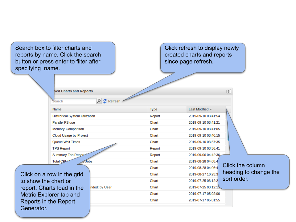
Fig. 7.5 Shows the saved charts and reports components.
7.4. Center Summary Component
Fig. 7.6 shows the center summary component. This component displays the thumbnails of charts from the center summary report that is tailored based on user role. Clicking on a thumbnail opens a modal containing an interactive version of the chart. The user can open the chart in Metric Explorer to modify it. Note that charts modified in Metric Explorer have to be saved and added to the center summary report in order to be displayed as a thumbnail in the center summary component. The user can control the time period of the charts by using the time range menu. The user can also download the charts as a PDF by clicking the Download Report button.
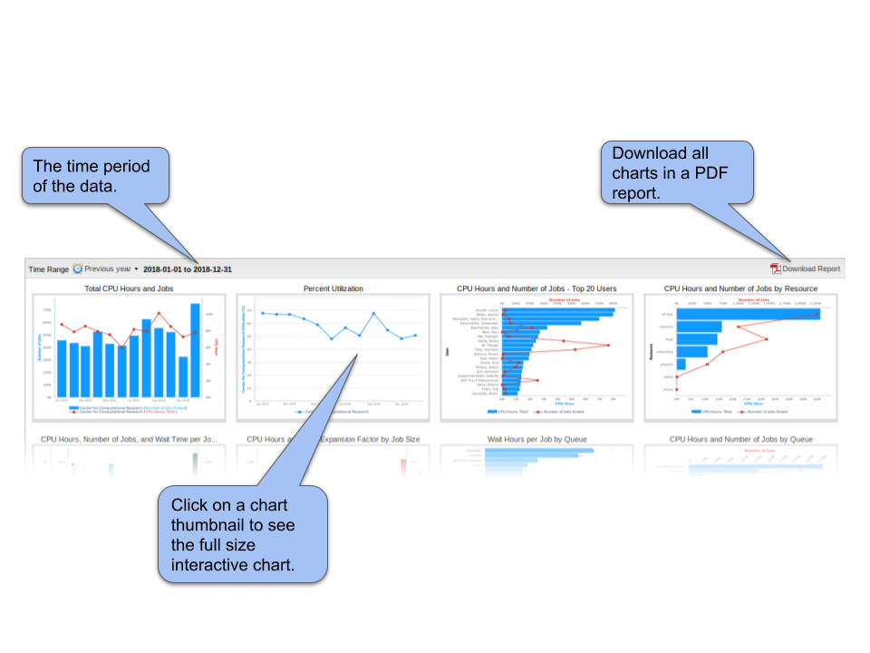
Fig. 7.6 The center summary report shows thumbnails of charts from the center summary report that is tailored based on user role.
7.5. Center Report Card
The center report card component is provided by the optional XDMoD AppKernels module. The component shows a summary of the results of recent application kernel jobs. Fig. 7.7 shows an annotated example of the center report card.
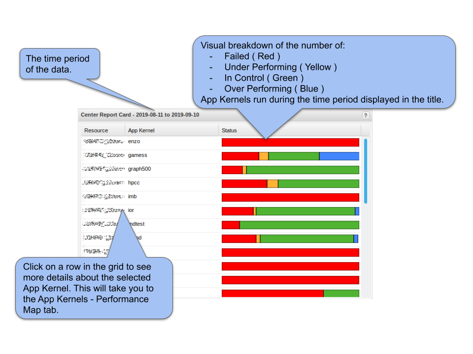
Fig. 7.7 An annotated example of the Center Report Card component that is available in the optional AppKernels module.
7.6. Jobs Component
The Jobs component displays information about recent HPC jobs. An annotated example is shown in Fig. 7.8. The job information is based on the Job Performance (SUPReMM) realm if the Job Performance module is installed. If the Job Performance module is not installed then the data are obtained from the Jobs realm and the component will display ‘N/A’ in the CPU column indicating that the cpu usage is not available. The information displayed in the Jobs component is restricted by XDMoD’s role based access controls. A summary of the data available is shown in Table 7.4 below. The Filter by Person widget is not displayed for the user role since it is superfluous.
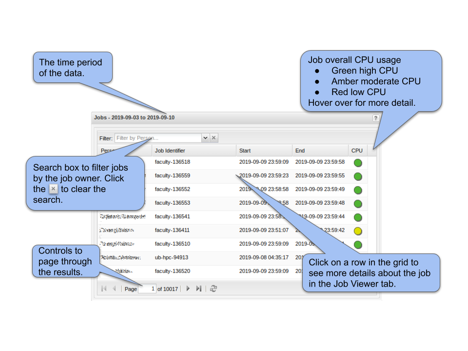
Fig. 7.8 Annotated example of the Jobs component. The User role does not have permission to list other users jobs and does not have the Filter by Person widget. The Job overall CPU usage information is only available if the optional Job Performance (SUPReMM) XDMoD module is installed.
XDMoD account role |
Information available |
|---|---|
User |
ACCESS HPC jobs that were run by the user. |
Principal Investigator |
ACCESS HPC jobs that were run by the user and HPC jobs that were run on the PIs projects. |
Center Staff |
All HPC job data for the Center and all ACCESS jobs run by the user. |
Center Director |
All HPC job data for the Center and all ACCESS jobs run by the user. |
Campus Champion |
All ACCESS HPC job data for users at the same Institution and all ACCESS HPC jobs run by the user. |
Program Officer |
All data |
7.7. Job Efficiency Component
The Job Efficiency component is only available if the Job Performance module is installed. The Job efficiency in XDMoD is defined based on a comparison of the resources (CPU, Memory, etc.) requested to those used by an HPC job. The information in the Job Efficiency component is subject to the same role-based access controls as the Jobs component as listed in Table 7.4. An annotated example of the component view for Center Staff and Center Director roles is shown in Fig. 7.9. The Principal Investigator role does not have a toolbar that switches the data grouping between user and PI. The User role example is shown in Fig. 7.10.
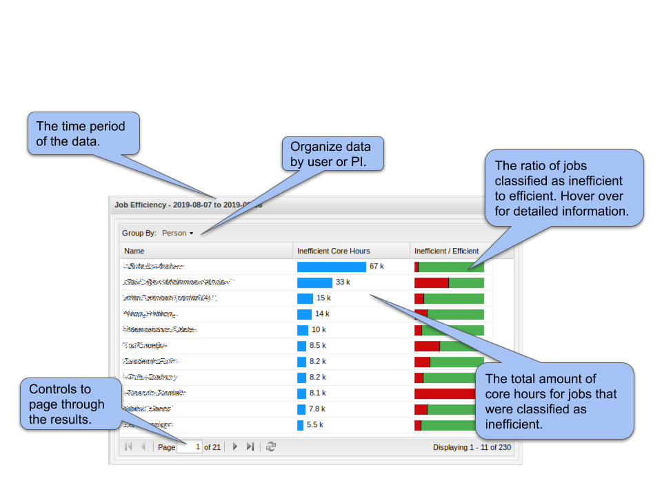
Fig. 7.9 Annotated example of the Job Efficiency component. The total number of jobs and core hours are shown broken down by efficiency categorization. Click on a row in the table to open a window that lists the jobs that were classified as inefficient.
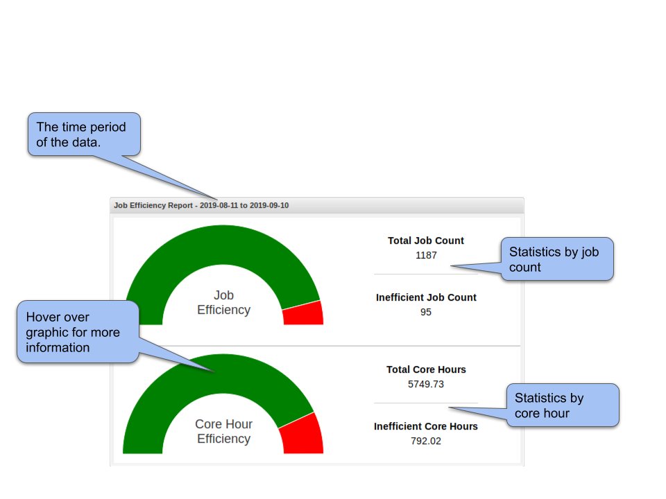
Fig. 7.10 Annotated example of the Job Efficiency component for XDMoD accounts with User role. The total number of jobs and core hours are shown broken down by efficiency categorization. Click on the bar chart to show the information about the jobs that are summarized.
7.8. Allocations Component
The Allocations Component shows a summary of allocation information. An example of the Allocations Component is shown in Fig. 7.11 below. Clicking on the component will load the Allocations Tab
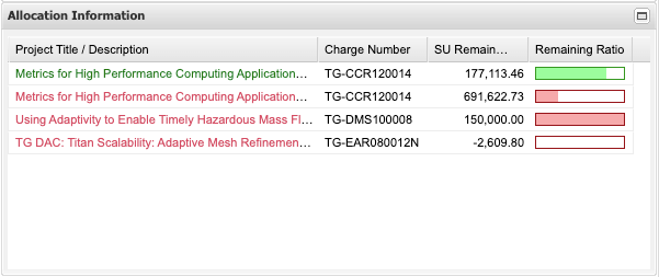
Fig. 7.11 Allocations Component