9. Metric Explorer
The Metric Explorer allows you to create complex plots containing multiple metrics. It has many point-and-click features so you can easily add and filter plotted data and customize plot appearance.
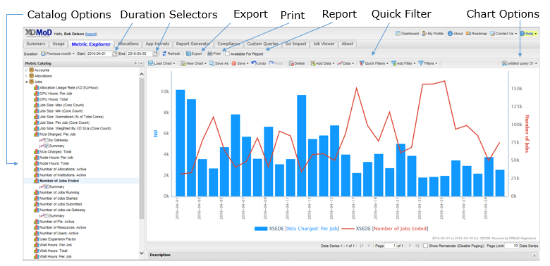
Fig. 9.1 Metric Explorer
The Quick Filter drop-down menu in the top toolbar allows you to rapidly focus the information source used by the Metric Explorer. Based on the quick filter selected, the values that are displayed will vary. For example, if you are a PI, selecting the PI quick filter provides access to the information from all of your students’ jobs; however, if you select User, you see only the information from jobs that you submitted yourself.
Other features of the top toolbar include:
Duration Selectors: The Duration Selection Toolbar is provided for selection of the desired time frame. To define a custom timeframe, specify a start and end date in the date fields to the right of the Duration drop-down menu.
Export Menu: Allows you to download the currently visible chart in graphical or datasheet form, and in various formats.
Print: Prepares a version of the chart for printing, and automatically presents you with a print dialog.
Available For Report: when checked, the exact chart will be included in the report generator’s list of available charts.
For more information about the top toolbar, refer to the Common User Interface Elements section in this document.
The Chart Options region above your chart gives you ultimate flexibility in the amount and type of statistics you want to view at any time. The Chart Options region comprises five sections: Charts, Data, Global Filters, and Options. Any changes you make in each section will be immediately reflected in the chart.
The Chart Viewer is the area where the chart is generated by using the chart settings. The chart viewer also uses a paged view. When not all of the data series fit on one chart, multiple charts will be generated. Buttons are provided above the chart for navigation through the charts, when needed. The maximum number of data series in the chart, or page size, can be configured in the chart limit input box above the chart.
The sections that follow discuss the Chart Options region in more detail.
9.1. Managing Charts
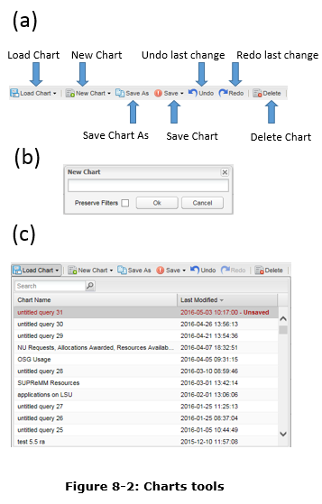
Fig. 9.2 Charts Section |
The Charts section (Fig. 9.2 a) allows you to manage chart presets. Chart presets are mappings between all the components involved in the chart (e.g. data series, filters, etc.) and the textual identifier you assign to each query. Once you click on Similarly, you can click on In earlier versions of XDMoD, charts were automatically saved. However, the current version gives you more control over your charts. You must manually save your charts by clicking on either the Save or the Save As button, see Fig. 9.2 a. Charts or changes to charts that you do not explicitly save will be lost when you exit XDMoD. An Undo button allows you to cancel the last change, and a Redo button lets you cancel the effect of the last Undo. To access your saved charts, simply select the preset from the Load Chart list (Figure 9-2c). If you have lots of charts, you can utilize the Search field located in the top left of the Load Chart area to target specific charts. |
9.2. Basic Chart Options
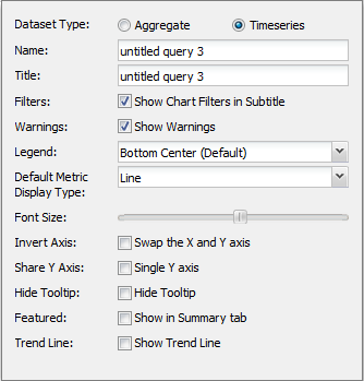
Fig. 9.3 Chart Options |
The Basic Chart Options button can be found at the top right of the chart viewer (Fig. 9.1). It allows you to customize general chart settings, see Figure 9-3.
|
In the present version of the Metric Explorer, you can easily change plots by simply clicking on the data series in the chart. A dialog box opens (Fig. 9.4) allowing a wide range of changes, including adding another metric, drilling downs, and options that alter the display format.
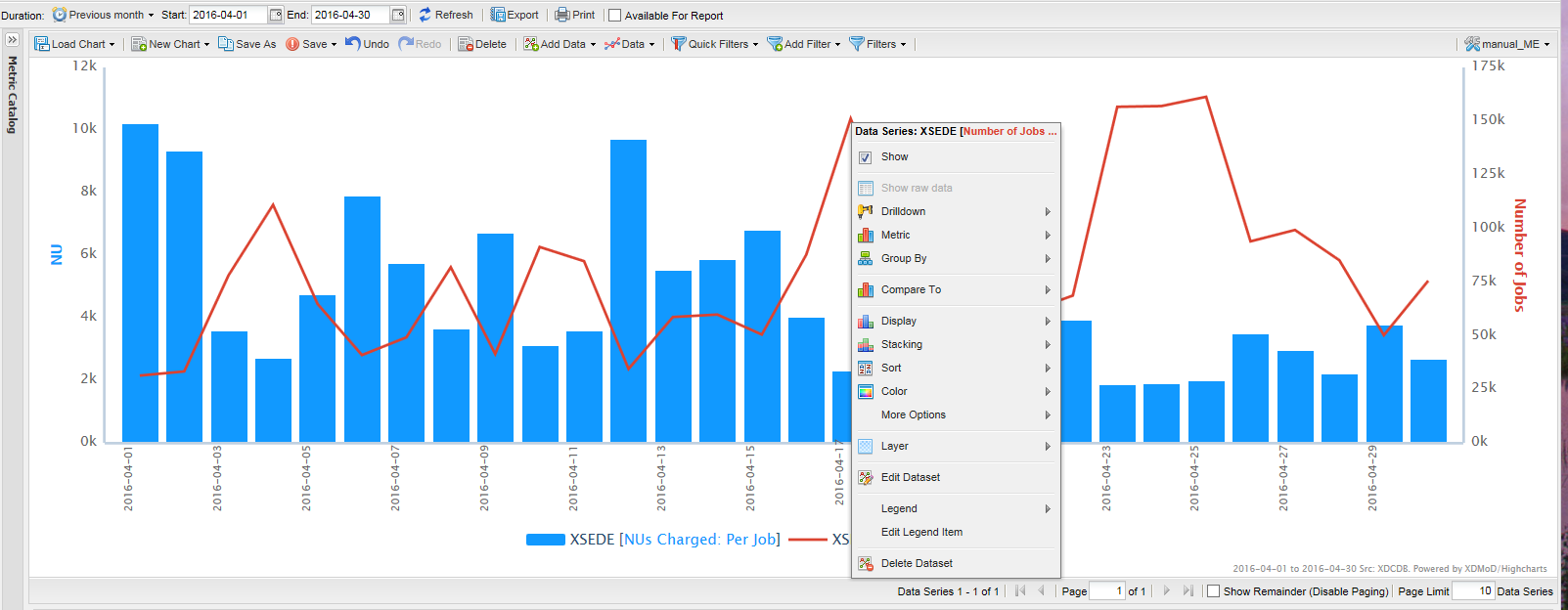
Fig. 9.4 In the Metric Explorer Plots can easily be changed directly by clicking on them.
9.3. Additional Chart Features
Clicking on a y-axis label will open a dialog box next to the clicked label. Through this dialog box you can adjust the minimum and maximum values of the range for any of the y-axes on the plot. You can reset these values by clicking on the “Reset Range” button or by erasing the values. Additionally, you can enable a logarithmic scale for that y-axis.
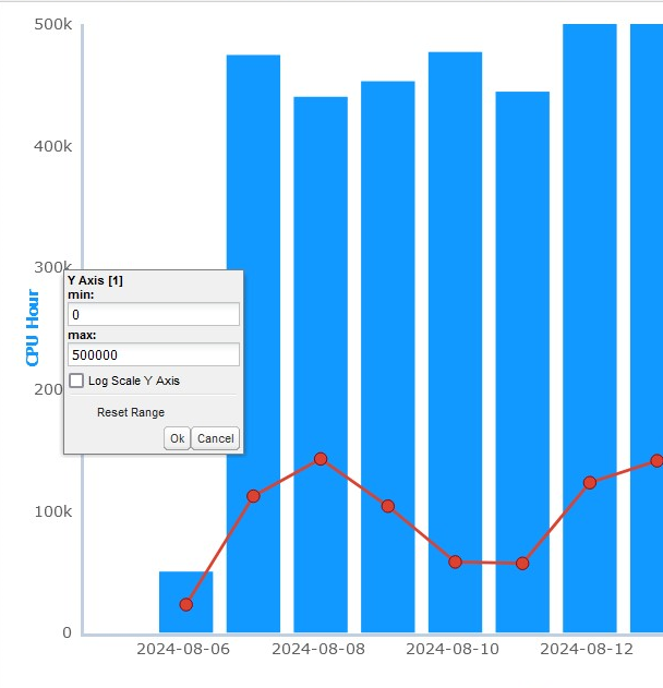
Fig. 9.5 You can adjust the range and enable a log scale by clicking on a y-axis label.
Clicking on an x-axis label will open a dialog box next to the clicked label. Through this dialog box you can adjust the time duration for the chart. The options available replicate the duration toolbar.
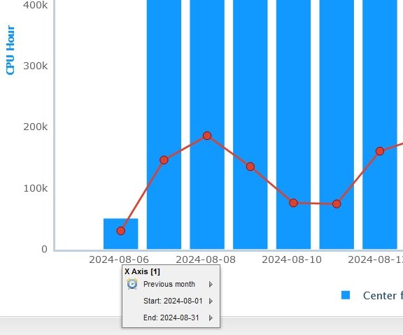
Fig. 9.6 You can adjust the time duration by clicking on an x-axis label.
Clicking on a legend entry will open a dialog box next to the clicked entry. The context menu provided through the legend entry is the same as clicking on a point in the plot. The only option that is excluded is the “Show Raw Data” option.
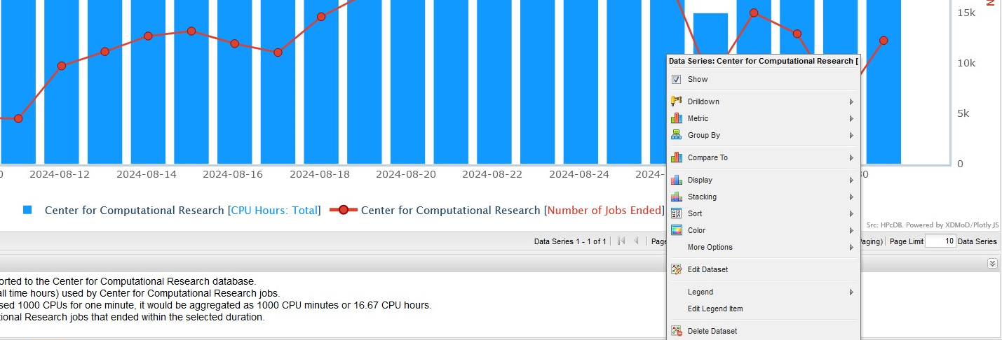
Fig. 9.7 You can interact with a data series context menu by clicking on its respective legend entry.
For Metric Explorer charts, the zoom level of the plot is reset differently than the other tabs. The zoom level can be reset by clicking on the chart and choosing the “Reset Zoom” option from the context menu.
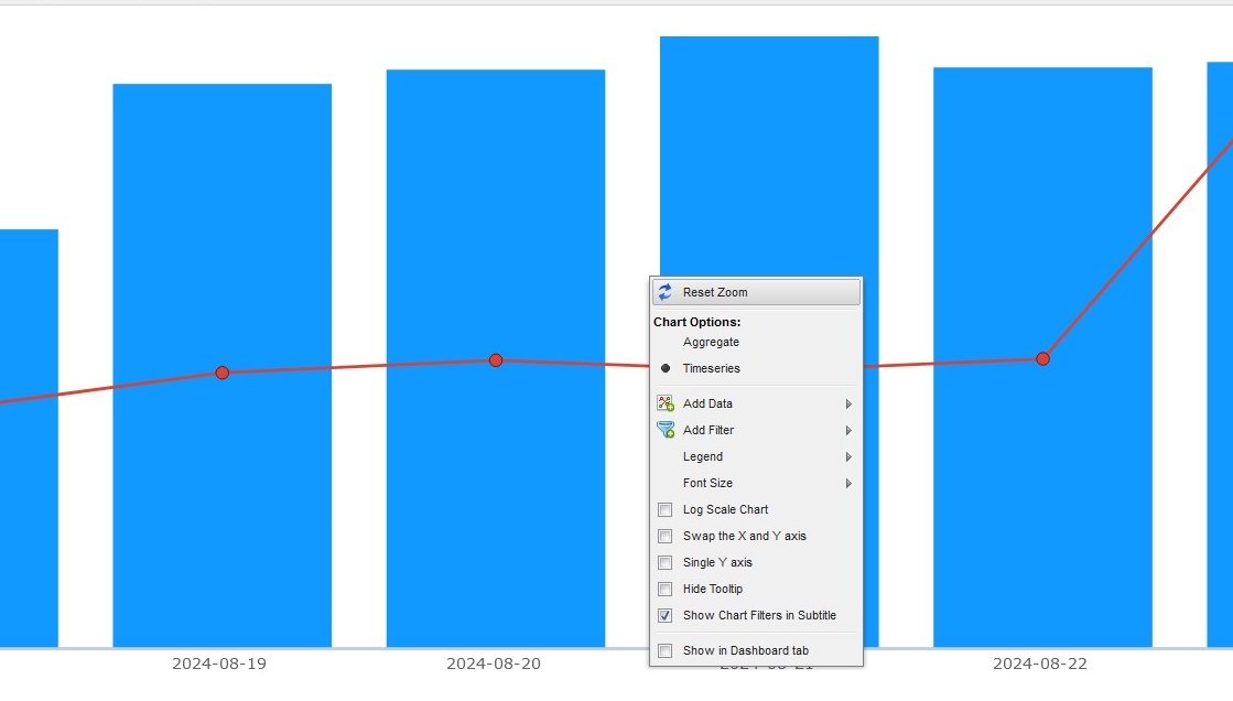
Fig. 9.8 You can reset the zoom level of a chart by clicking on it and choosing “Reset Zoom.”
9.4. Managing Data Series
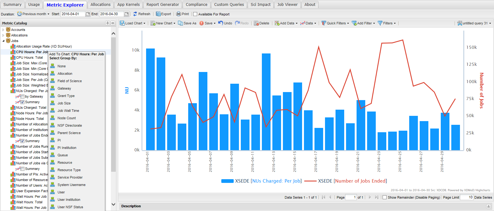
Fig. 9.9 Adding additional data to a chart is made easier through the menu on the left-hand-side. Here we show how to add CPU Hours Per Job to an existing plot of NUs charged Per job and Number of jobs Ended (Selecting CPU Hours Per Job is shown in the upper left corner of the window).
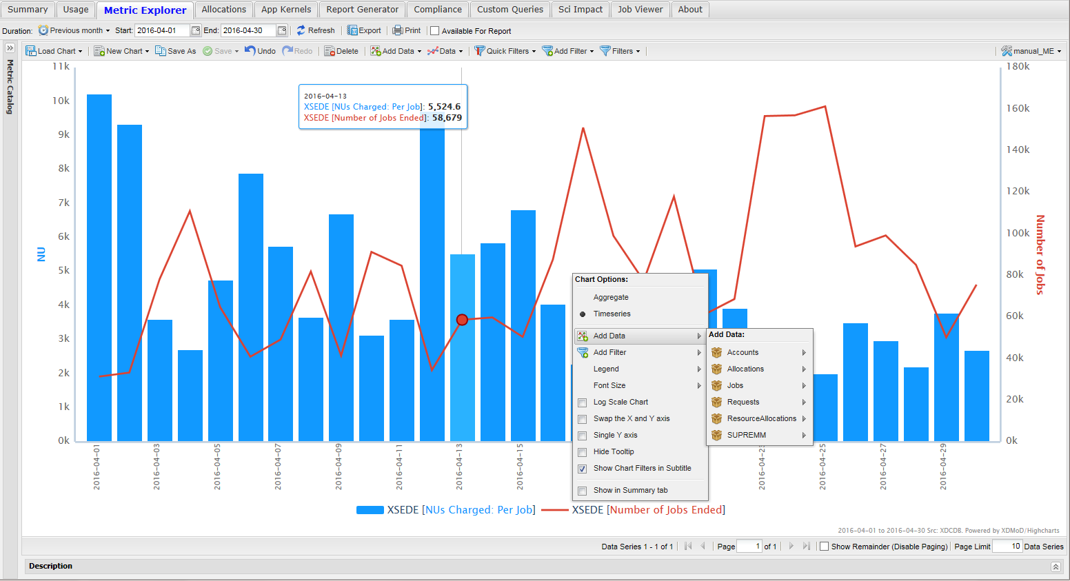
Fig. 9.10 Adding data to the plot is as simple as clicking on the chart.
Adding another data series to a chart can be accomplished in several ways. Fig. 9.9 shows that clicking on a metric in the chart tree brings up a dialog box. This dialog allows you to choose what data will be displayed and how it will be grouped. In addition, clicking in the chart view area will bring up a chart options box (Fig. 9.10) that allows you to choose to add a new metric. Clicking on a particular data series also brings up a dialog box that has an option to select a new metric.
An alternative way to introduce data into a chart is to click on the Add Data button as highlighted in Fig. 9.11. Doing so will present you with a collection of categories referred to as realms. Click on a realm to reveal all the respective metrics. In Fig. 9.11 the allocations realm has been selected showing 6 possible metrics. Clicking on the XD SU’s Allocated metric brings up the Data Series Definition dialog box. The Data Series Definition dialog box allows you to control how the metric is to be represented and displayed on the chart. In addition, filters can be applied to the data series for even more precision. For example, you may be interested in the number of jobs run by a particular user at an institution for a particular time frame. Using filters allows you to acquire this information.
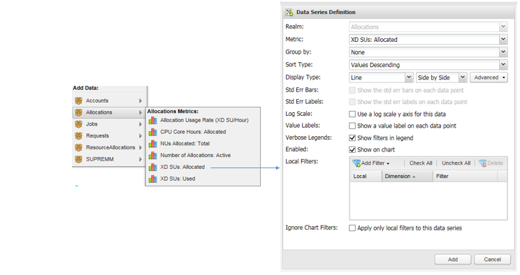
Fig. 9.11 Data Series workflow of Metric Explorer
In addition to adding new metrics to a plot, the Metric Explorer also allows the user to drill down for more detailed information on a particular metric. Fig. 9.12 shows the dialog box that opens when you click on a data series within the chart viewer. Selecting “Drilldown” will display the data analyzed by the chosen dimension or grouping, as described by Section 5.3 (the Chart Viewer) previously.
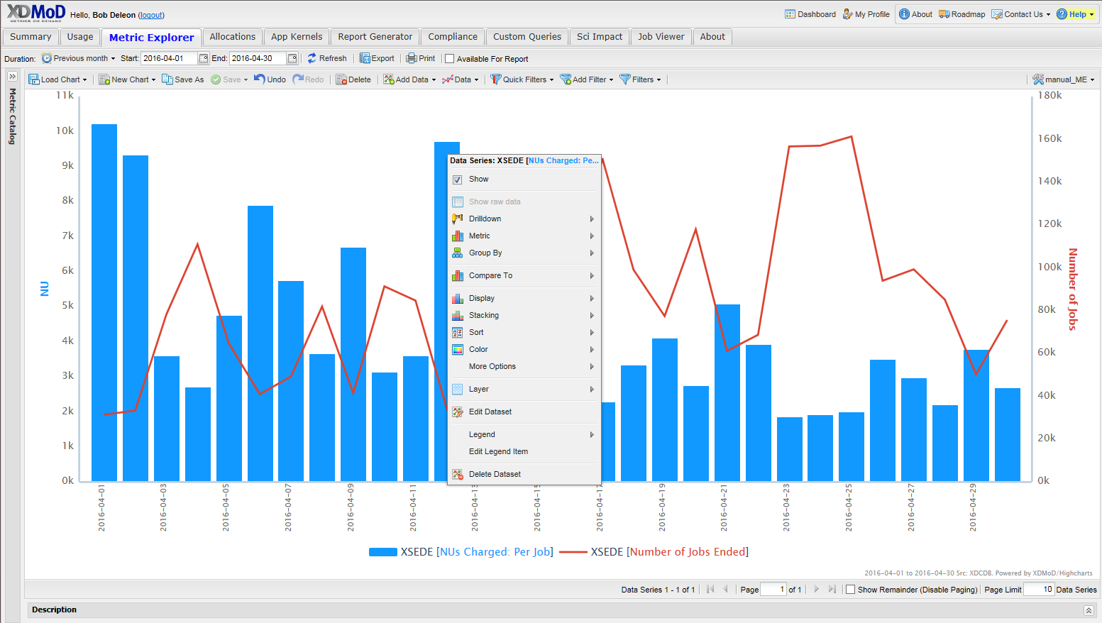
Fig. 9.12 Changing how the data for a given data series is displayed can now be achieved simply by clicking on the data series to bring up a dialogue box.

Fig. 9.13 Data section of Metric Explorer
The Data section of the Metric Explorer allows you to include one or many metrics on a single chart. As illustrated in Fig. 9.13, you are given many options which allow you to customize the look of each data series. By double-clicking on a data entry in the grid below, you will be presented with a dialog which gives you finer control of how the data can be represented.
9.5. Managing Filters
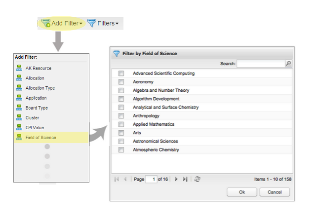
Fig. 9.14 Filters section of Metric Explorer |
As mentioned in the previous section, filters allow you to focus on a subset of the data. To apply filters to your data, you can either consult the Local Filters section of the Data Series Definition dialog (see Fig. 9.14), or make use of Global Filters (see Fig. 9.15). Local Filters are solely tailored to a single data series, whereas Global Filters are applied to all the data series you have introduced into the Data section of the Metric Explorer. To create a filter, click on the Add Filter button (as highlighted in Fig. 9.15). Doing so will provide you with a list of dimensions (or parameters) you can filter with. Once you have selected a dimension, you will be presented with a dialog allowing you to navigate, search, and select parameter values. Click on OK to apply any selected filters. |

Fig. 9.15 Understanding filter logic |
Filters in the Metric Explorer are applied as follows: Dimensions are logically and-ed together, and values associated with the same dimension are logically or-ed together. An example of filter logic is illustrated in Fig. 9.15. |

